DataMapPlot库可绘制漂亮的数据地图,以便应用于演示文稿、海报和论文中。重点是用尽可能少的工作量生成美观的静态图, 您只需在数据地图中标记点簇。虽然这涉及到大多数美学选择的自动化,但该库提供了多种方法来根据您的需求定制结果图。
一、安装
pip3 install datamapplot
二、准备数据
2.1 读取arxiv.csv.gz
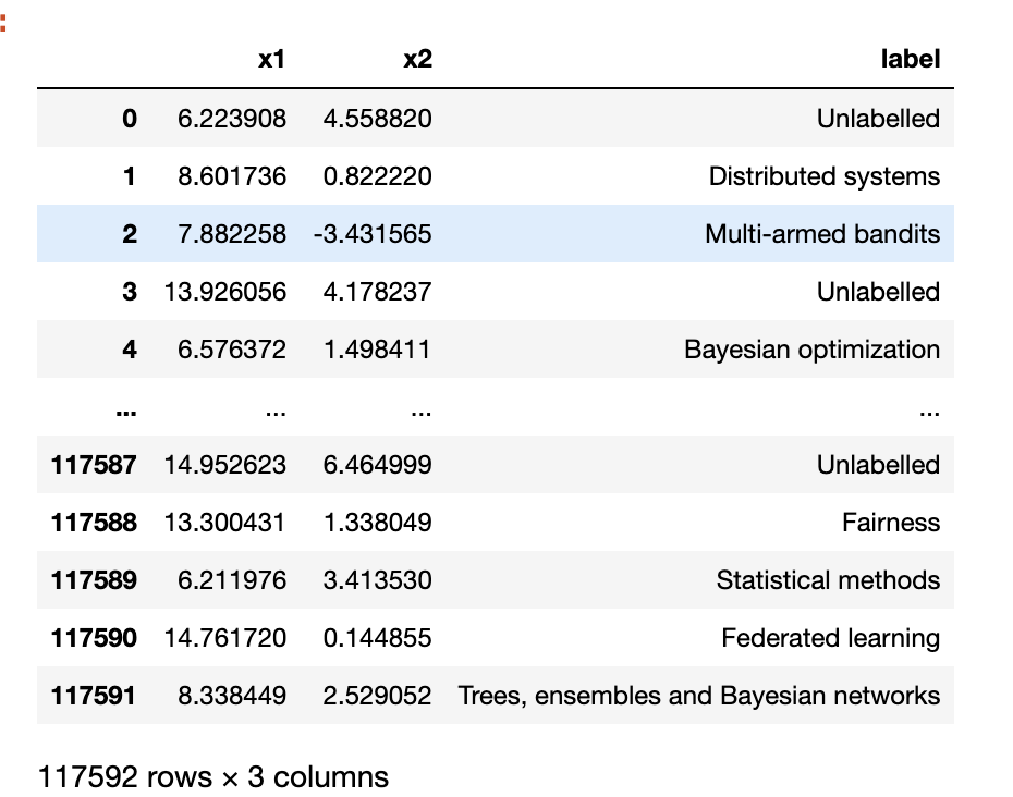
点击下载 arxiv.csv.gz , 该数据有 x1、 x2、 label 三个字段,其中
- x1、x2是降维后的特征信息,常见的降维算法有pca、UMAP, t-SNE等
- label是标注(类别)信息
df = pd.read_csv('arxiv.csv.gz', compression='gzip')
df
2.2 录入logo
使用PIL读取 arxiv_logo.png(点击下载该图片),并转化为array数组型数据。
![]()
import PIL
import numpy as np

arxiv_logo = np.asarray(PIL.Image.open('arxiv_logo.png'))
三、绘图
import pandas as pd
import numpy as np
import matplotlib.pyplot as plt
import matplotlib_inline
matplotlib_inline.backend_inline.set_matplotlib_formats('png', 'svg')
import PIL
df = pd.read_csv('arxiv.csv.gz', compression='gzip')
data_map_coords, labels = np.array(df[['x1', 'x2']]), df['label']
arxiv_logo = np.asarray(PIL.Image.open('arxiv.png'))
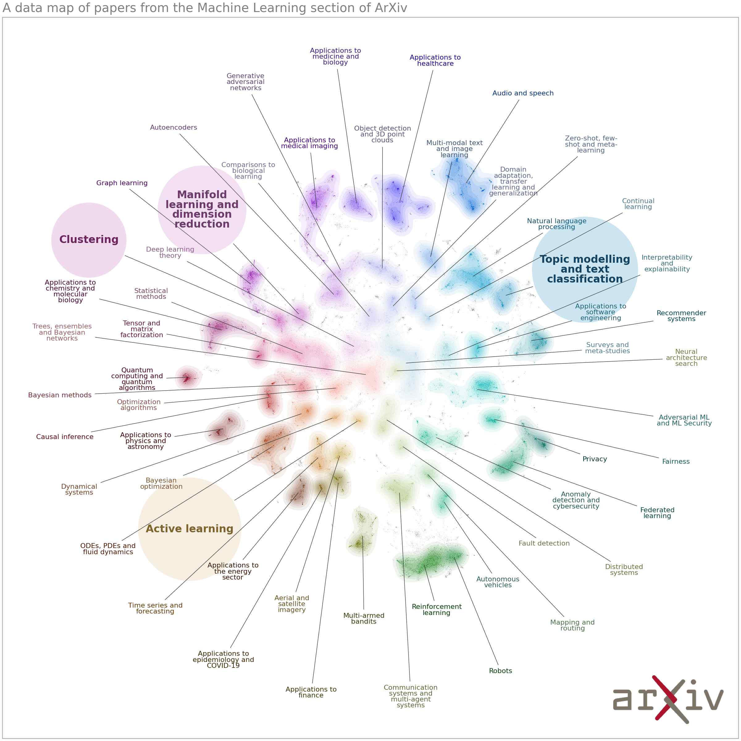
highlight_labels = ["Clustering",
"Manifold learning and dimension reduction",
"Active learning",
"Topic modelling and text classification"]
datamapplot.create_plot(
data_map_coords,
labels,
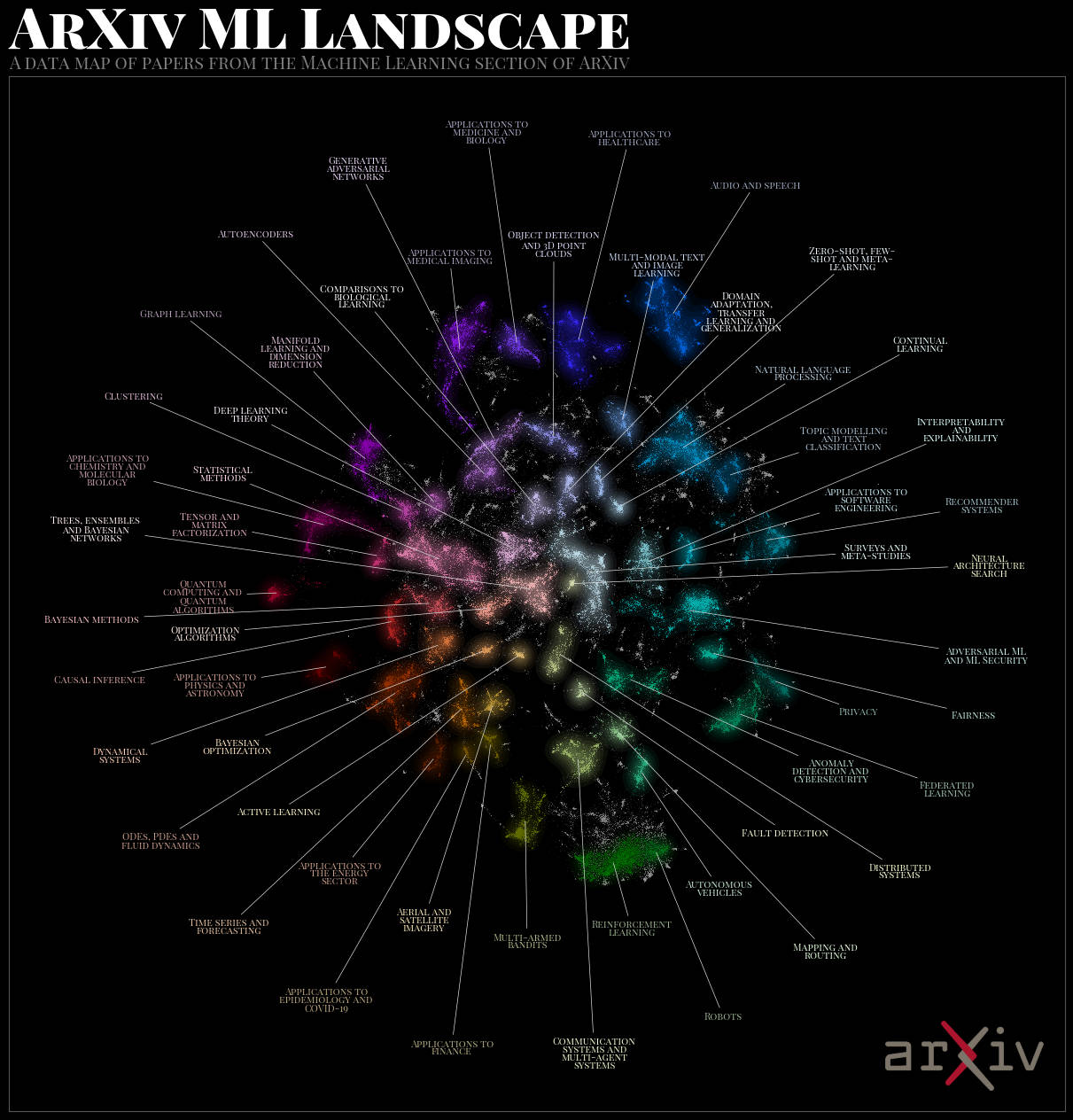
title = "ArXiv ML Landscape",
sub_title = "A data map of papers from the Machine Learning section of ArXiv",
highlight_labels = highlight_labels,
label_font_size = 8,
highlight_label_keywords = {
"fontsize": 12, "fontweight": "bold", "bbox":{"boxstyle":"circle", "pad":0.75}
},
logo=arxiv_logo,
)
plt.savefig('arxiv_white.png', dpi=200)
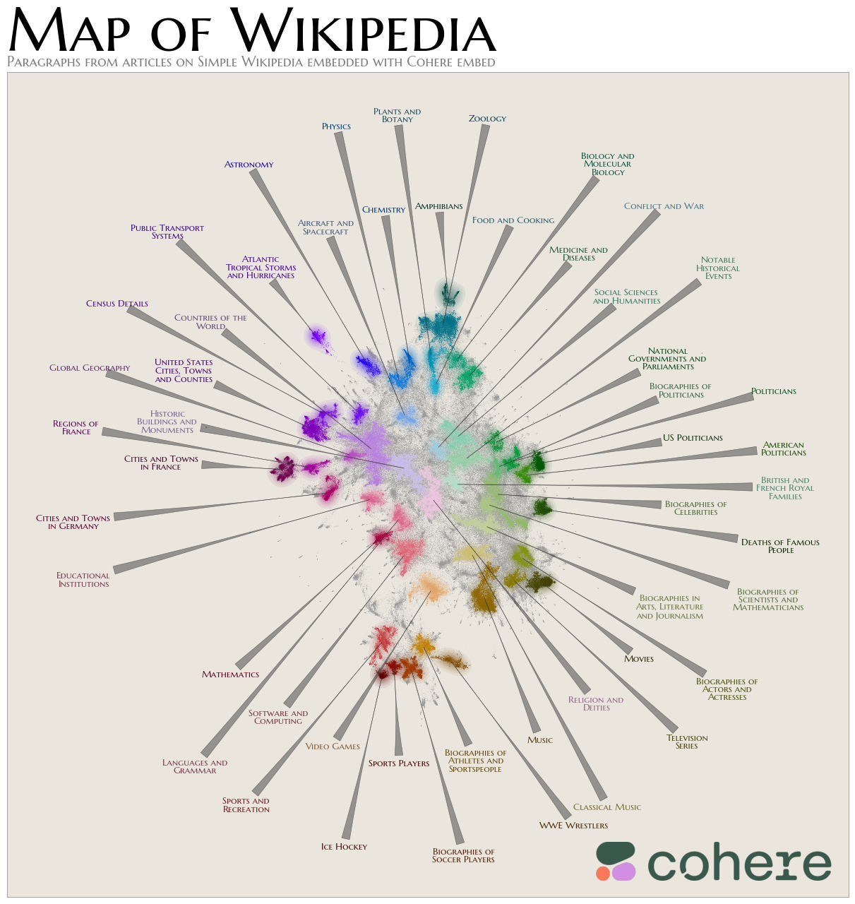
三、Gallery
更多内容,可阅读文档 DataMapPlot: https://github.com/TutteInstitute/datamapplot