ggplot() 函数对任何数据科学家都是必不可少的, ta是一种非常简单的绘图函数。刚开始接触可能看起来很难, 不过不要害怕,因为一旦学了基础知识,一切都会变得清晰! 让我们开始!
之前分享过 R语言 | ggplot2简明绘图之散点图,是以散点图为例简单讲解ggplot2的绘图,今天我们将以直方图作为主讲图形。
直方图是另一种ggplot2常用的图形,与散点图类似,也是分多个图层进行逐层绘制。
准备
导入本文要用到的包
library(tidyverse) ## ── Attaching packages ─────────────────────────────────────── tidyverse 1.3.2 ──
## ✔ ggplot2 3.3.6 ✔ purrr 0.3.4
## ✔ tibble 3.1.8 ✔ dplyr 1.0.9
## ✔ tidyr 1.2.0 ✔ stringr 1.4.1
## ✔ readr 2.1.2 ✔ forcats 0.5.1
## ── Conflicts ────────────────────────────────────────── tidyverse_conflicts() ──
## ✖ dplyr::filter() masks stats::filter()
## ✖ dplyr::lag() masks stats::lag()library(primer.data) #准备数据
library(showtext)## Loading required package: sysfonts
## Loading required package: showtextdbshowtext_auto() #显示中文
#install.packages("MetBrewer")
library(MetBrewer) #配色包选择数据
使用data()函数可以查看现有的数据集有哪些,
data()这里选择nobel,使用View(nobel)可以在新打开一个窗口,方便了解数据
View(nobel)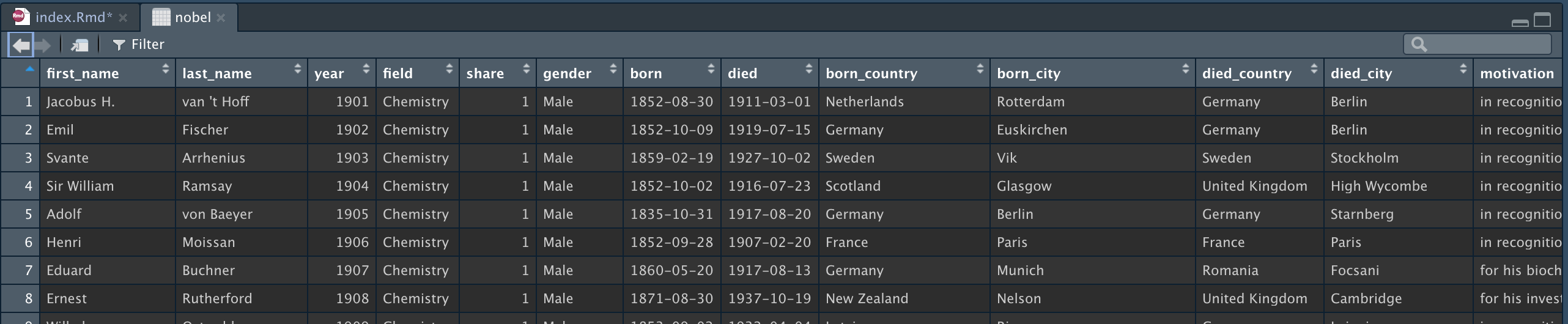
画布gglot
画画需要画布,对于数据分析的绘图也是同理。导入相关R包后, 用ggplot函数构造一个画布。因为还没设定数据,所以这是一个空画布
ggplot()
我们将使用 nobel数据集,传入数据的代码ggplot(data=nobel)
ggplot(data=nobel)
画布看起来依然是空白的,不要紧张。理解这个之前类比PS这类绘图软件,将修图工作看做是很多个图层的叠加。现在我们使用时依然在最底层的ggplot图层,在ggplot函数内添加mapping=aes()参数,准备添加x轴、y轴、color。的图层。
ggplot(data=nobel,
       mapping=aes())
注意了,现在图层即将发生变化。我们选择设置x轴 aes(x=year)
- x轴 year
ggplot(data=nobel,
       mapping=aes(x=year))
现在我们将开始添加高层次的图层,也会显示越来越多的信息。
添加geom
现在添加geom层,该层是通过 + 构建在ggplot层之上。这里使用 geom_histogram() 绘制直方图,
ggplot(data=nobel,
       mapping=aes(x=year))+
  geom_histogram()
## `stat_bin()` using `bins = 30`. Pick better value with `binwidth`.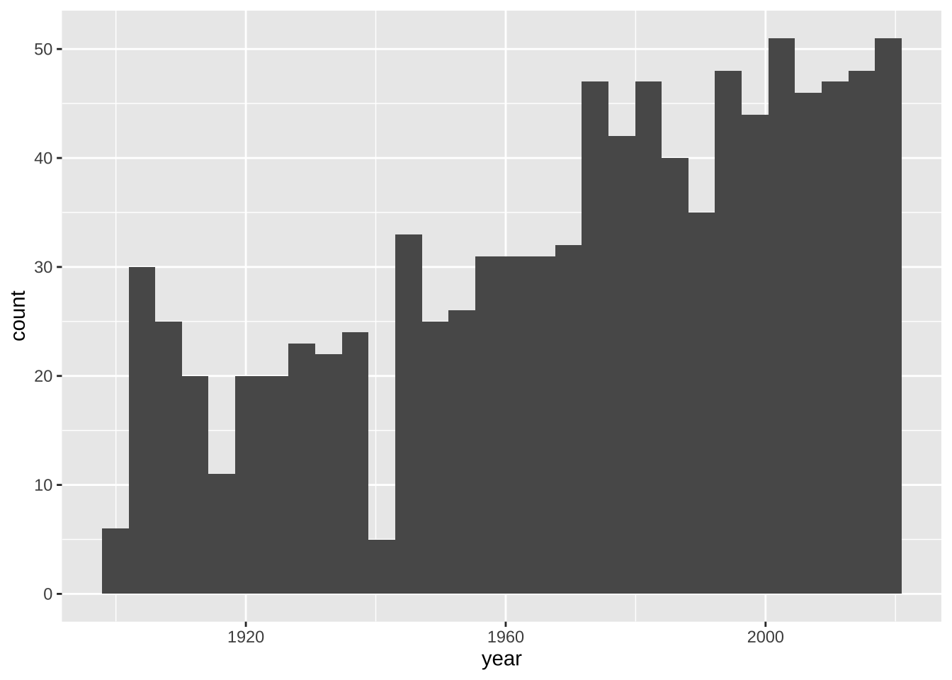
不错,接下来添加color
fill和color
按照学科对每个时期的诺奖进行专业分类,使用aes中的fill参数。
ggplot(data=nobel,
       mapping=aes(x=year, fill=field))+
  geom_histogram()
## `stat_bin()` using `bins = 30`. Pick better value with `binwidth`.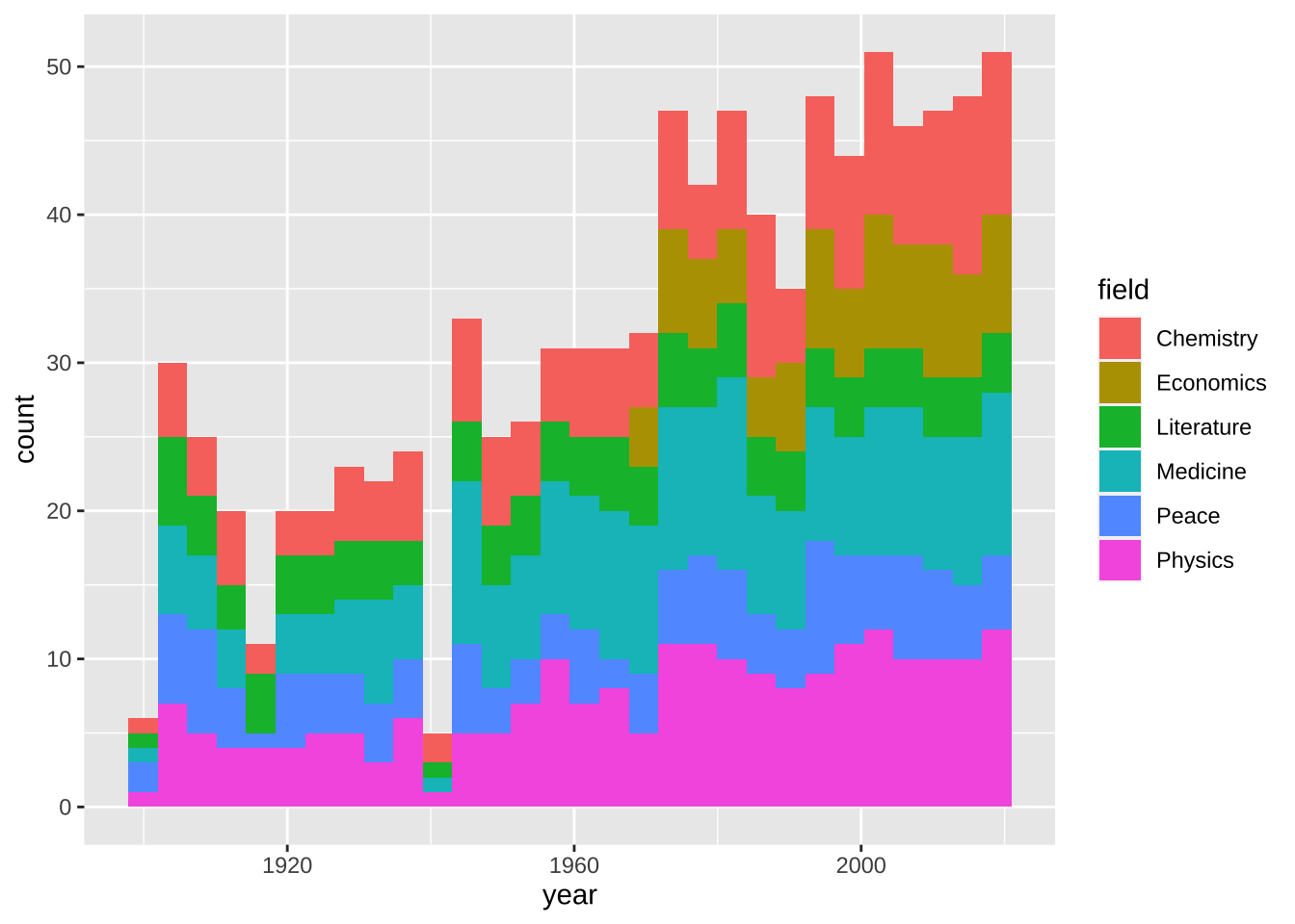
但同一时期,不同专业之间没有边界区分,容易混乱。这里设置 geom_histogram() 的 color="white"。
ggplot(data=nobel,
       mapping=aes(x=year, fill=field))+
  geom_histogram(color="white")
## `stat_bin()` using `bins = 30`. Pick better value with `binwidth`.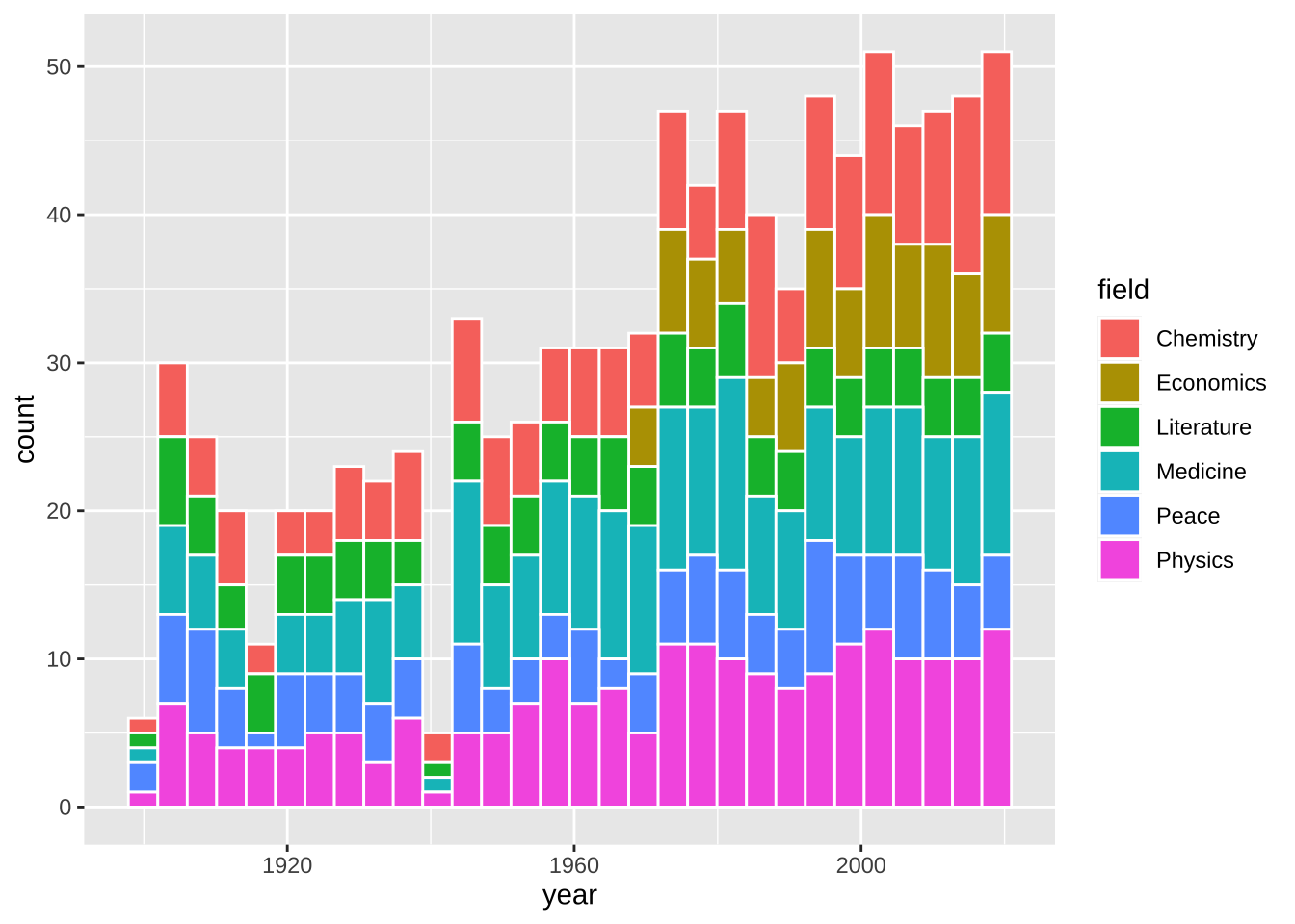
更改配色
更改geom层的颜色,所以该层紧贴geom层,且在geom层之上。设置方法可以使用 scale_fill_manual() 即可。scale_fill_munual() 中的values可以传入颜色字符串。
ggplot(data=nobel,
       mapping=aes(x=year, fill=field))+
  scale_fill_manual(values=c("red",
                             "orange",
                             "yellow",
                             "green",
                             "blue",
                             "purple"))+
  geom_histogram(color="white")
## `stat_bin()` using `bins = 30`. Pick better value with `binwidth`.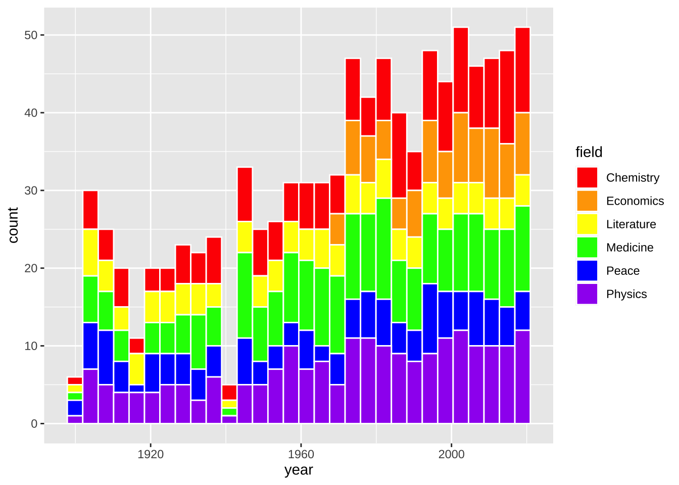
漂亮! 这些颜色真的很明艳, scale_fill_munual() 还可以选择十六进制颜色字符串进行颜色自定义
ggplot(data = nobel,
       mapping = aes(x = year,
                     fill = field)) +
  scale_fill_manual(values = c("#f73c39",
                               "#f79b39",
                               "#f7ee39",
                               "#228c14",
                               "#1e80c7",
                               "#7c148c")) +
  geom_histogram(color = "white")
## `stat_bin()` using `bins = 30`. Pick better value with `binwidth`.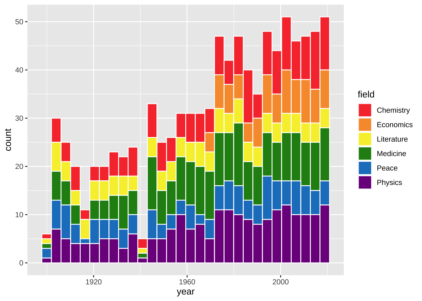
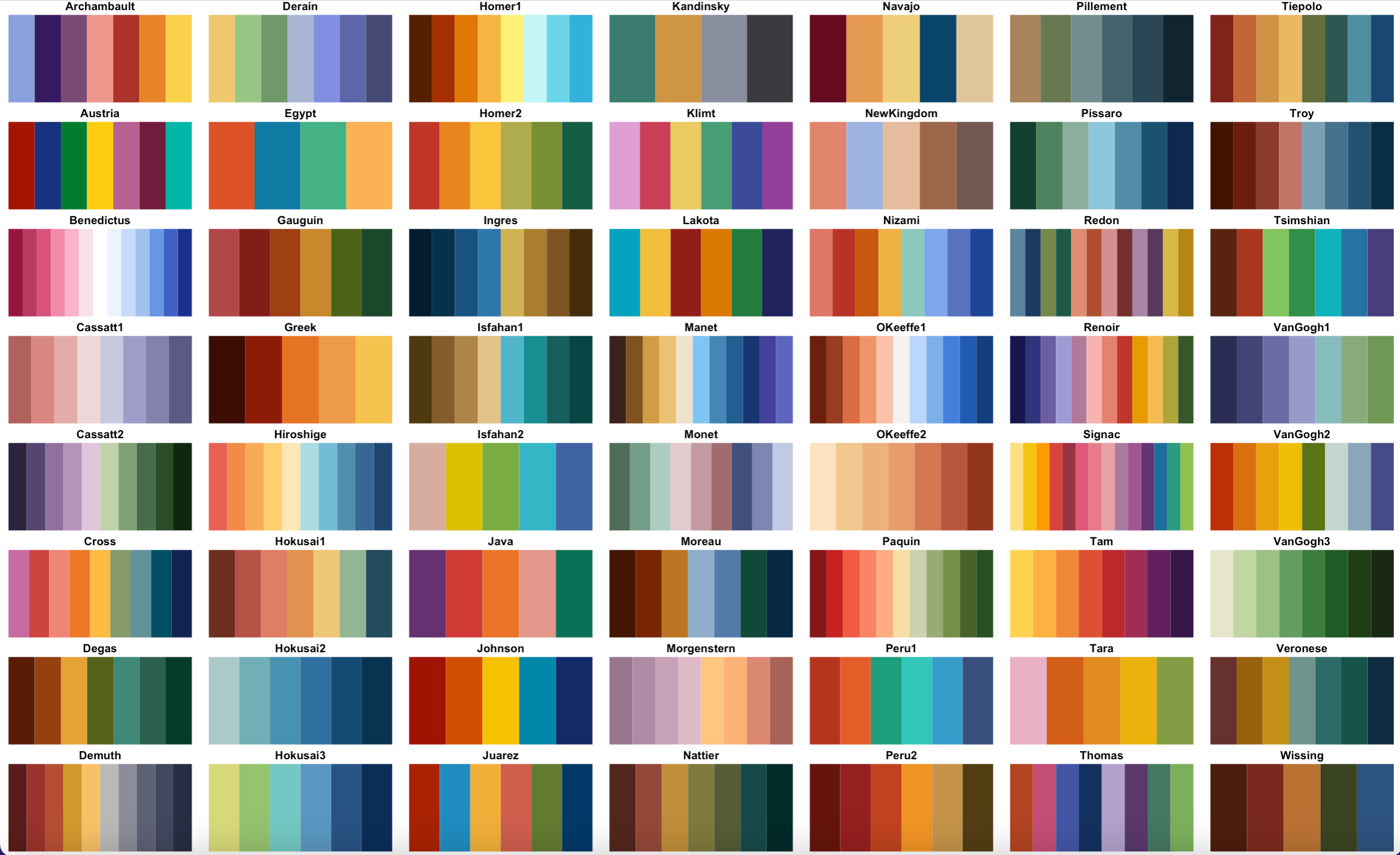
配色包MetBrewer
对于我们普通人而言, 不需要记住那么多颜色,只需要在配色方案中选择好看的配色即可。 MetBrewer是R语言的配色包,在文章开头已经提前导入了。下图是MetBrewer的配色方案,选择一种配色方案的名字,如Signac
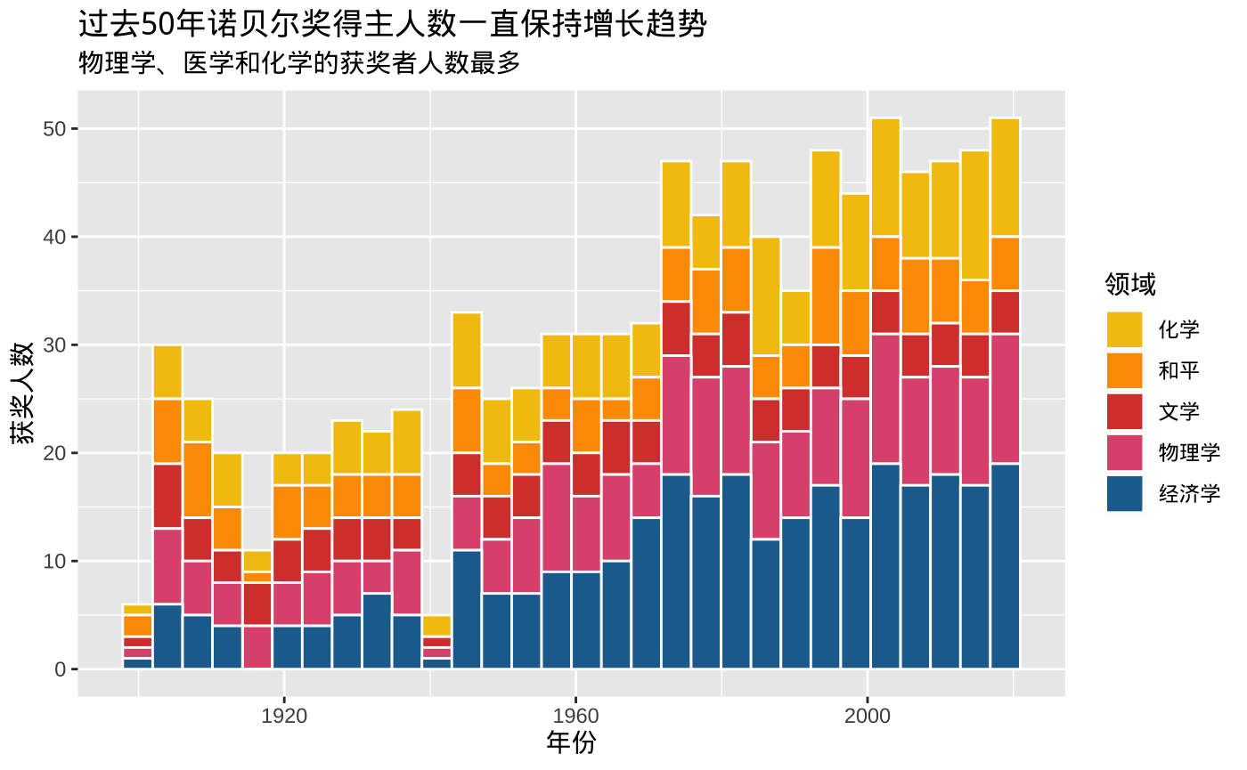
ggplot(data = nobel,
       mapping = aes(x = year,
                     fill = field)) +
  #选择Signac配色方案,使用其中6种颜色
  scale_fill_manual(values = met.brewer('Signac', 6)) +
  geom_histogram(color = "white")
## `stat_bin()` using `bins = 30`. Pick better value with `binwidth`.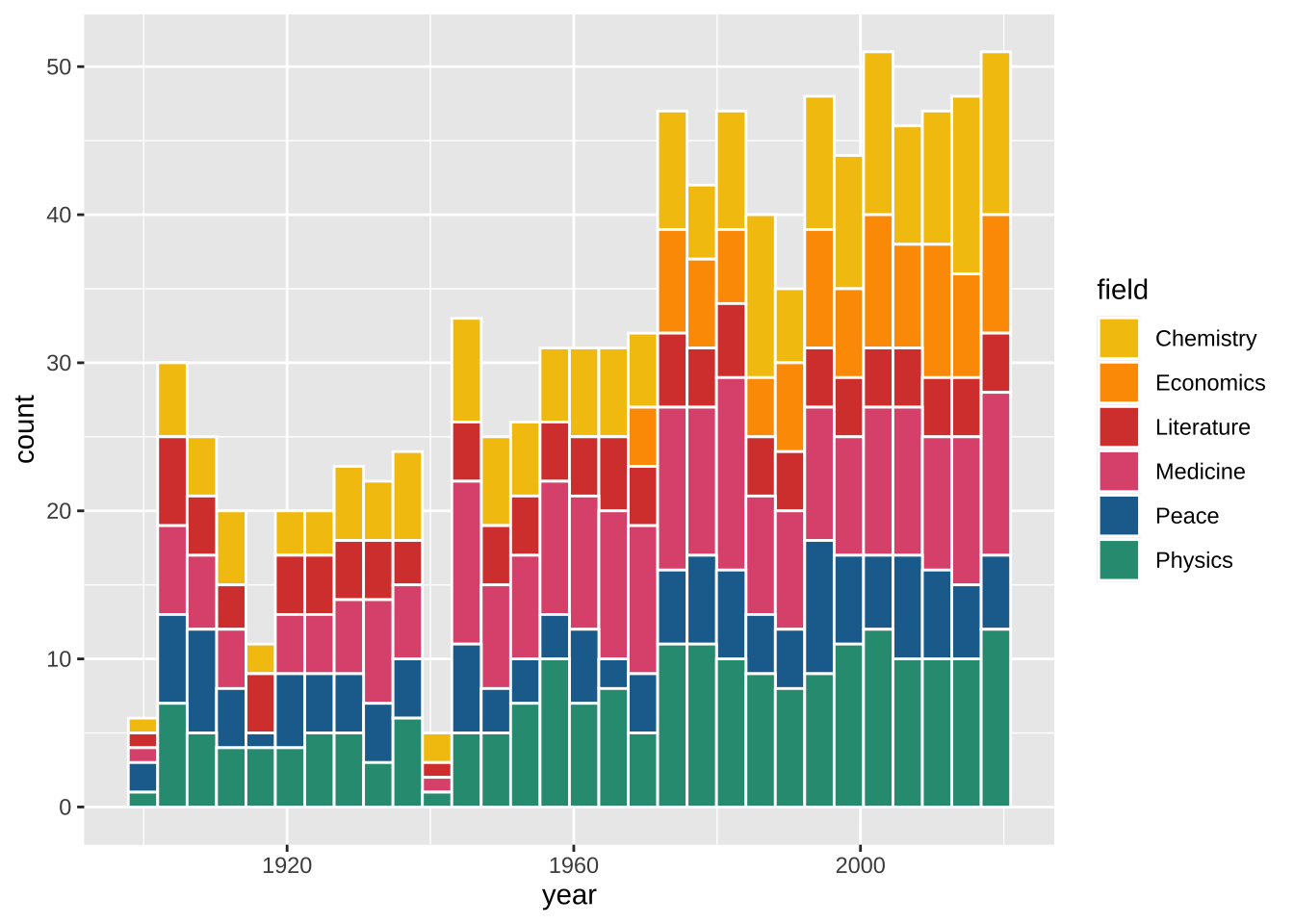
标签labs
现在我们需要用labs() 函数给图片添加标签图层。例如title、subtitle、caption、x、y、legend。
ggplot(data = nobel,
       mapping = aes(x = year,
                     fill = field)) +
  scale_fill_manual(values = met.brewer("Signac", 6)) +
  geom_histogram(color = "white") +
  labs(title = "Nobel prize laureate numbers have gone up in past 50 years",
       subtitle = "Physics, Medicine, and Chemistry have largest numbers of laureates",
       x = "Year",
       y = "Number of laureates")
## `stat_bin()` using `bins = 30`. Pick better value with `binwidth`.
现在x轴、y轴、标题都是大写,需要将field也大写。这里在labs(fill=‘Year’)更改year为Year
ggplot(data = nobel,
       mapping = aes(x = year,
                     fill = field)) +
  scale_fill_manual(values = met.brewer("Signac", 6)) +
  geom_histogram(color = "white") +
  labs(title = "Nobel prize laureate numbers have gone up in past 50 years",
       subtitle = "Physics, Medicine, and Chemistry have largest numbers of laureates",
       x = "Year",
       y = "Number of laureates",
       fill='Field')
## `stat_bin()` using `bins = 30`. Pick better value with `binwidth`.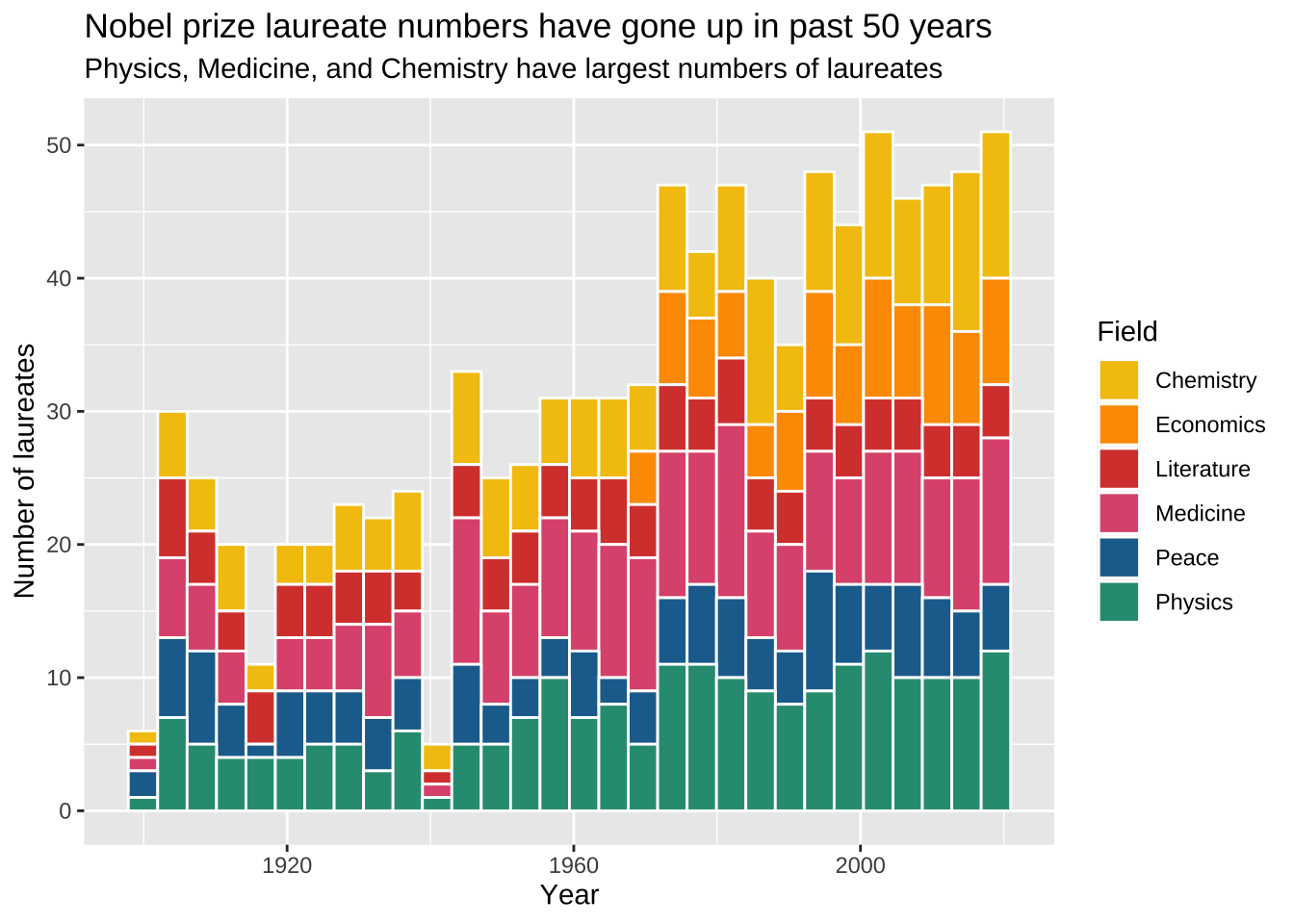
中文
默认ggplot2不支持中文,为了能显示中文,使用showtext包。前文已提前导入并初始化
library(showtext) #支持中文
showtext_auto()
运行中文的代码
#把学科转为中文
nobel2 <- nobel %>%
mutate(
field = case_when(field=='Chemistry' ~ '化学',
field=='Economics' ~ '经济学',
field=='Medicine' ~ '经济学',
field=='Peace' ~ '和平',
field=='Physics' ~ '物理学',
field=='Literature' ~ '文学'))
#绘图
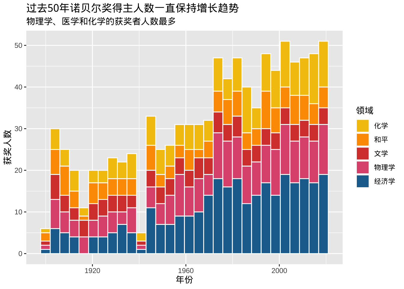
ggplot(data = nobel2,
mapping = aes(x = year,
fill = field)) +
scale_fill_manual(values = met.brewer("Signac", 6)) +
geom_histogram(color = "white") +
labs(title = "过去50年诺贝尔奖得主人数一直保持增长趋势",
subtitle = "物理学、医学和化学的获奖者人数最多",
x = "年份",
y = "获奖人数",
fill='领域')## `stat_bin()` using `bins = 30`. Pick better value with `binwidth`.